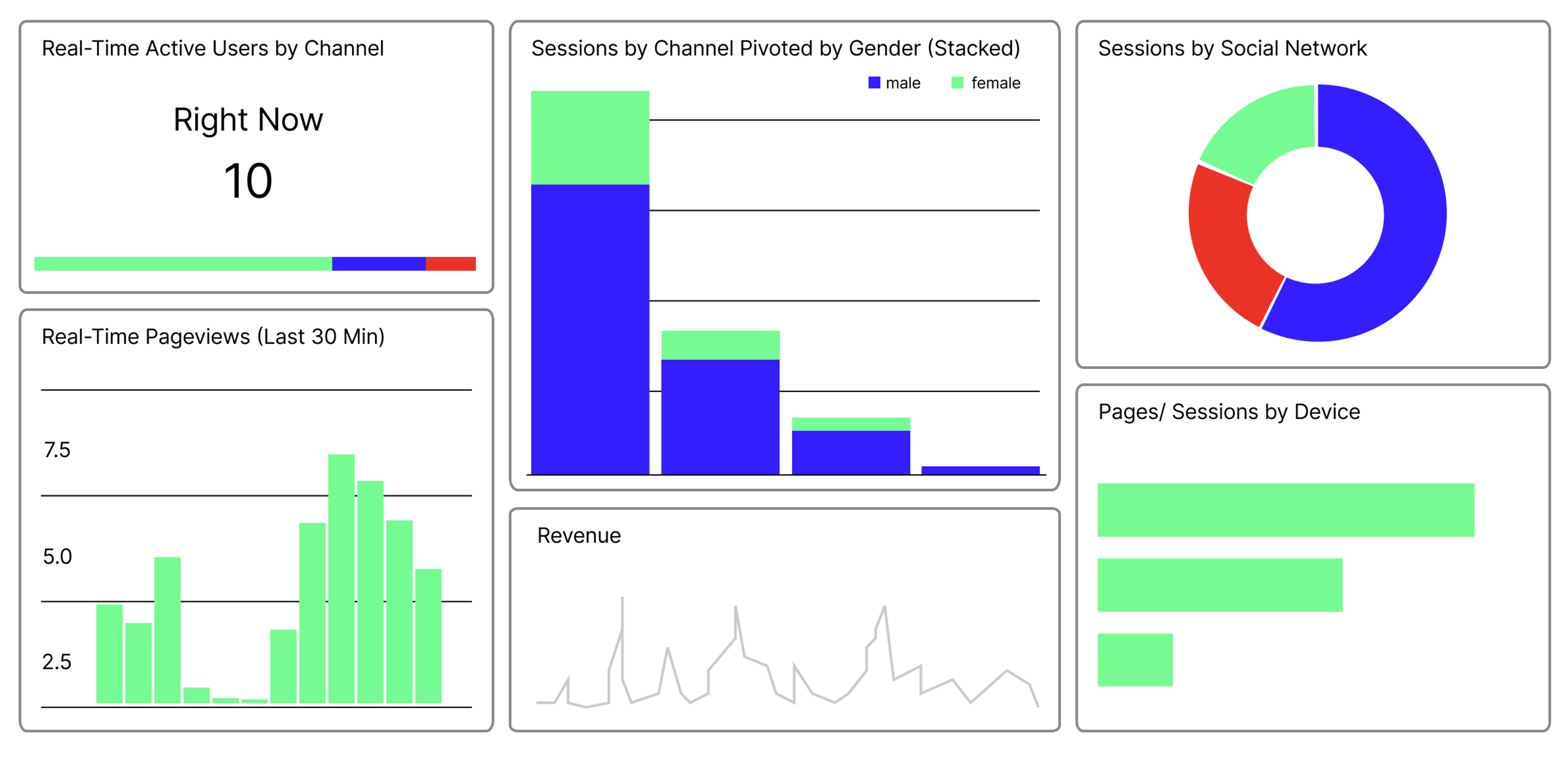
The Dashboard
Flashing lights, speedometers, gauges and arrows pointing in different directions. That’s how many people would describe dashboards, as we know them from cars, planes, and boats.
But if you google images of a dashboard, today, you are more likely to see images of a variety of graphs, numbers, and diagrams juxtaposed in a digital window. When we talk about data today, it’s these kinds of dashboards we’re talking about.
Fact
What is a dashboard?
In short, a dashboard is a display of data that allows you to monitor events, make decisions, inform others about findings, and see trends. They contain various visualisations of data, which together function on a single screen.
A dashboard provides a comprehensive overview of your data and offers key insights for quick decision-making.
A dashboard can highlight trends, patterns, gaps, and deviations. If an online store isn’t selling enough shoes, an analytical dashboard could, for example, reveal certain deviations that might not be as visible in a standard report: perhaps they don’t carry a specific type of shoe that is otherwise very popular?
It can also be used to focus on something—like keeping an eye on something related to our health—or to encourage a response or action —like seeing that you haven’t walked your ten thousand steps today.
When we say “your data”, we don’t necessarily mean your personal data here. It could of course be that, like when you have a dashboard with health data from a fitness watch. But it could just as well be business data.
On a dashboard, you can see if the company’s sales, combined with other defined KPIs, are functioning as they should. And it is on a dashboard that geologists monitor movements in the mountains from sensor data from landslide-prone areas.
What does the dashboard show?
Dashboards are usually interactive to a greater or lesser extent, in the form that users can explore the data by changing settings or adding filters. Dashboards that use real-time data will automatically update so that the presentation changes as the data changes.

An example of such a dashboard you might know is the front page of Google Analytics, which reports in real time how many people are on the website, and which at the same time provides data about where users come from and how they use the website.
As a rule, there is an analysis—everything from simple compilations to the use of machine learning—behind the data shown in a dashboard, so we are not looking at raw data.
Categories of dashboards
Dashboards can be divided into three different categories: operational, analytical, and strategic. Let’s take a closer look at these three: