When Data Becomes Visible: Visualisation
When we tell stories—whether in film, literature, or a speech—an important principle is to “show, don’t tell”.
Demonstrating an action or a scene, rather than describing what is happening, not only makes the content more interesting and vivid: It can also give the receiver a better understanding of what is happening.
Visualising data is also storytelling. Indeed, visualisations draw on the remarkable perceptual abilities that humans possess. It can help us better understand relationships between data: patterns, trends, and correlations between variables that we otherwise would have difficulty seeing.
Especially large and complex data, like information about geographical conditions, demographic changes, and broad historical trends, will often benefit from being presented in some form of visual format.
Let’s take a closer look at two quite different visualisations:
Two ways to visualise a network
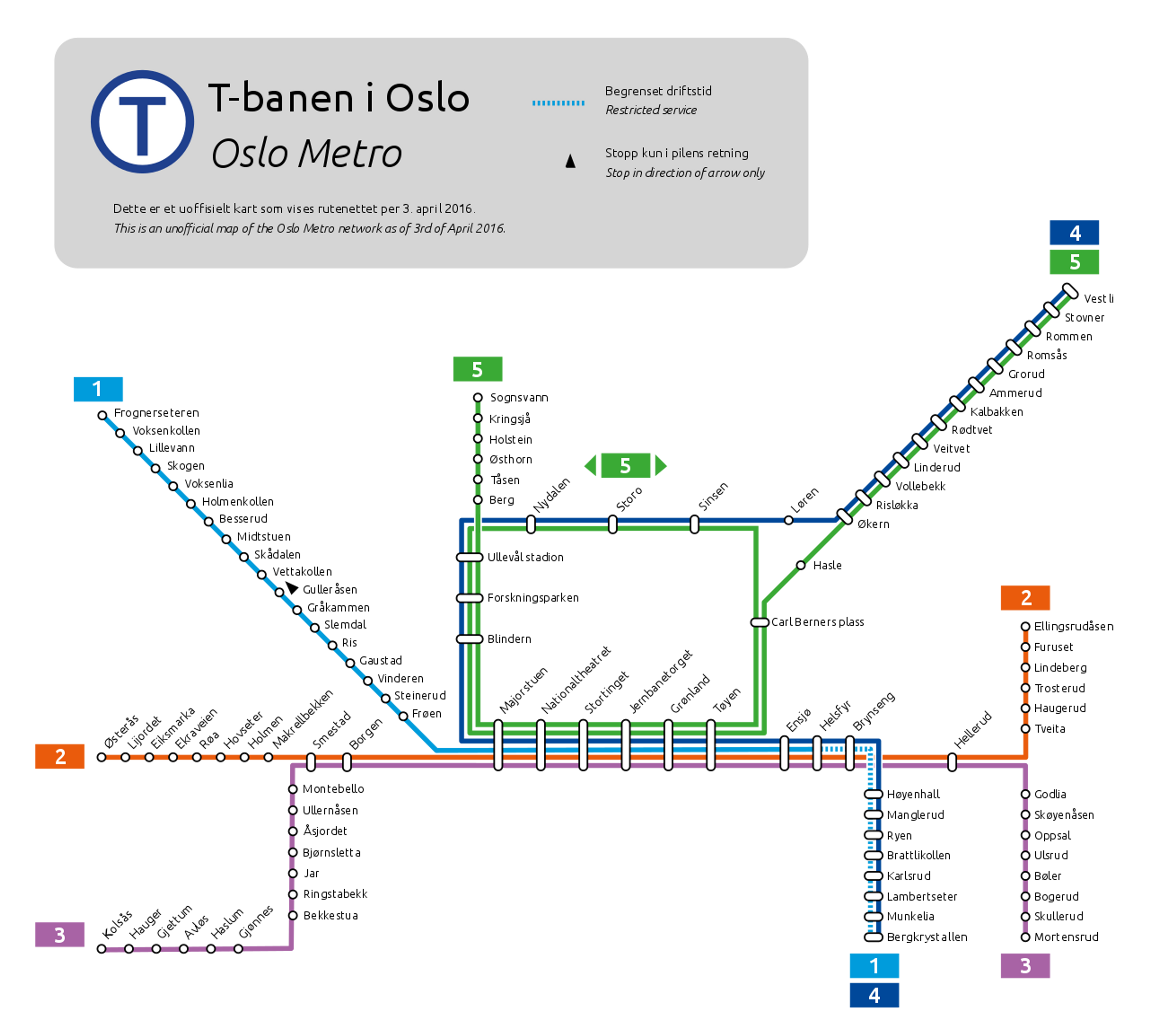
Norwegians may recognise the illustration above: a map of the Oslo Metro, indicating the direction of the different lines and how the various stations are connected.
On the other hand, the illustration below may look more like an abstract work of art. Actually, it is a visualisation of the scientific publications of 8500 different doctors between 2008 and 2012 regarding the Hepatitis C virus, and it shows how they have over 60,000 co-publications among themselves.
Python was used to process this data and Gephi to visualise it—to give an example of how these tools can be used in practice.
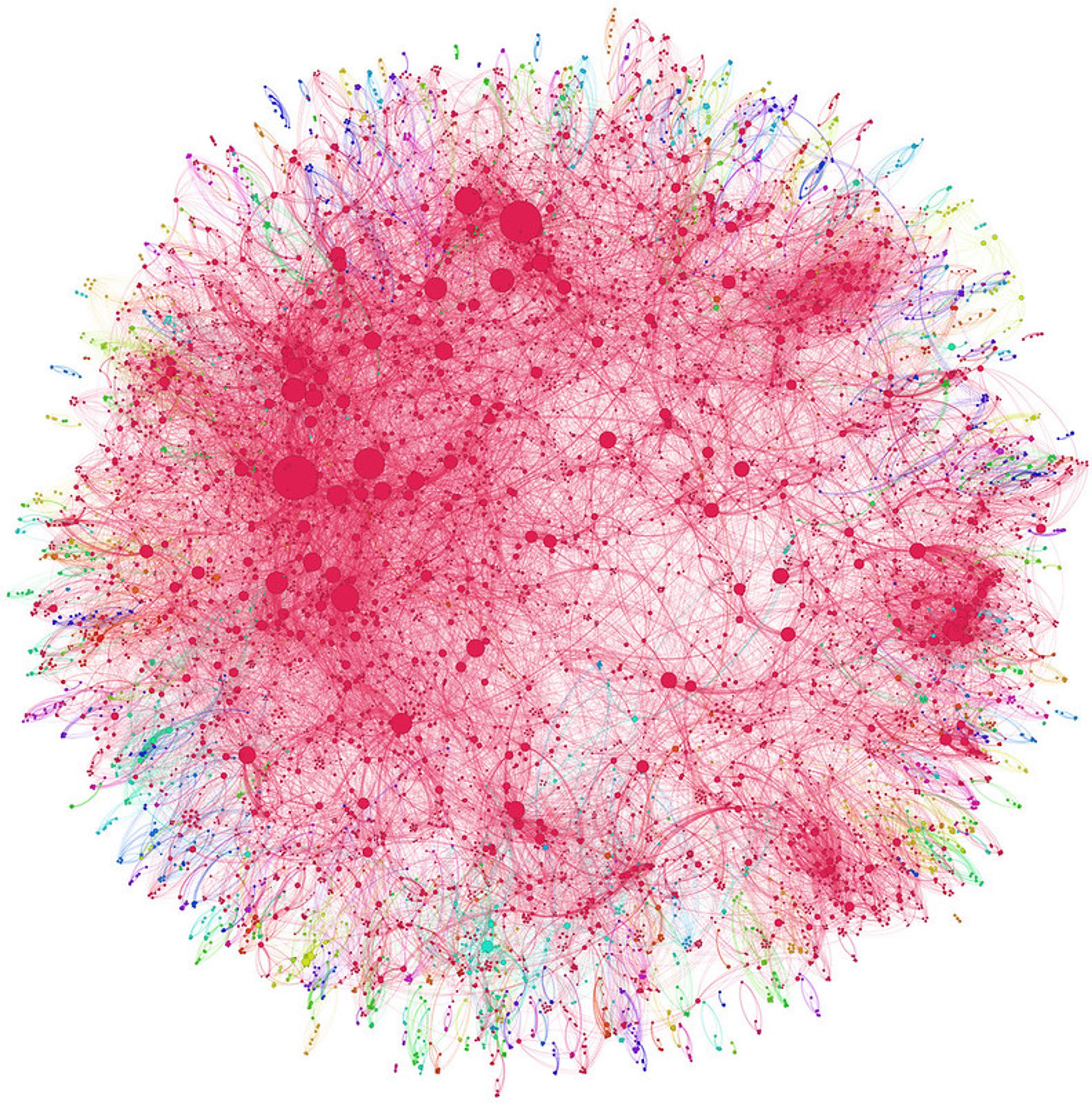
As you can see, these images are two different ways to visualise a network.
Different tools for different ends
As we can see, there are many different ways to visualise data, depending on the data you want to present and what points you want to convey. Tables, bars, and graphs are well-known examples that you’ve probably encountered many times before.
But also infographics, heat maps, flowcharts, timelines, animations, and even the metro map included above are ways to use visualisation to present data.
Actually, storytelling and data visualisation have several commonalities. Sometimes, it’s about finding creative, striking, and engaging ways to convey information: Colours, contrasts, movement, shapes, and symbols can be effective tools to get a point across.
Other times, it’s about making the information as simple as possible. If your findings are most easily explained through a simple bar chart—you make a bar chart!
The context of visualisations
All ways of visualising data have one thing in common: They are designed for a specific target group. In which context do you want to use these figures? Who are the interested parties? Who are you going to show it to?
A flow chart intended for decision-makers in a meeting room isn’t necessarily understandable for football supporters wondering which midfielder they should select for their fantasy team. Just as a heat map of Martin Ødegaard’s movements on the football field might not mean much to the aforementioned meeting participants.
Reading these visualisations can sometimes be intuitive, while at other times it requires practice and requires certain prior knowledge.
Visualisation in practice
We have briefly touched on how data is often visualised as diagrams, graphs, and tables. What do these look like?
Let’s say we have data that shows changes in the amount of carbon emissions in a number of European countries, and how it relates to various different factors. Now our task is to find different ways to visualise this data.
First, we’re going to look at how this can be presented through a number of well-known (and a couple of lesser-known) methods. Let’s start with the classic table.
Table
And here we have it! Here’s data on carbon emissions, population, and gross domestic product (GDP) for five European countries compiled in a table.

For this table to be as intelligible as possible, you might want to sort the figures in a particular order, for instance alphabetically—or in ascending order where the countries are sorted from lowest to highest proportion of carbon emissions.
Here, we can look for multiple potential correlations and insights. Which countries have the highest carbon emissions compared to their population? And what if we additionally consider GDP—do the richest countries also contribute the most emissions?
Not all these insights are as easily interpreted from a table. Let’s explore a couple of handy visualisations.
Bar charts and line charts
Bar charts and line charts are among the most common ways to visualise data, and most people have encountered these at one point or another. They are easy to understand, provide a quick overview of the data, and are easy to create.
Bar charts are best suited for comparing figures for different categories against one another, while line charts are great for conveying changes over time.
A line chart connects data points with lines in a coordinate system. This is typically used to display trends in share prices in the stock market, or to show changes in temperature over time. Do you recall when we, in the statistics section, explored average temperatures for different months in nine different ways? Here you can see these temperatures visualised in a line chart:

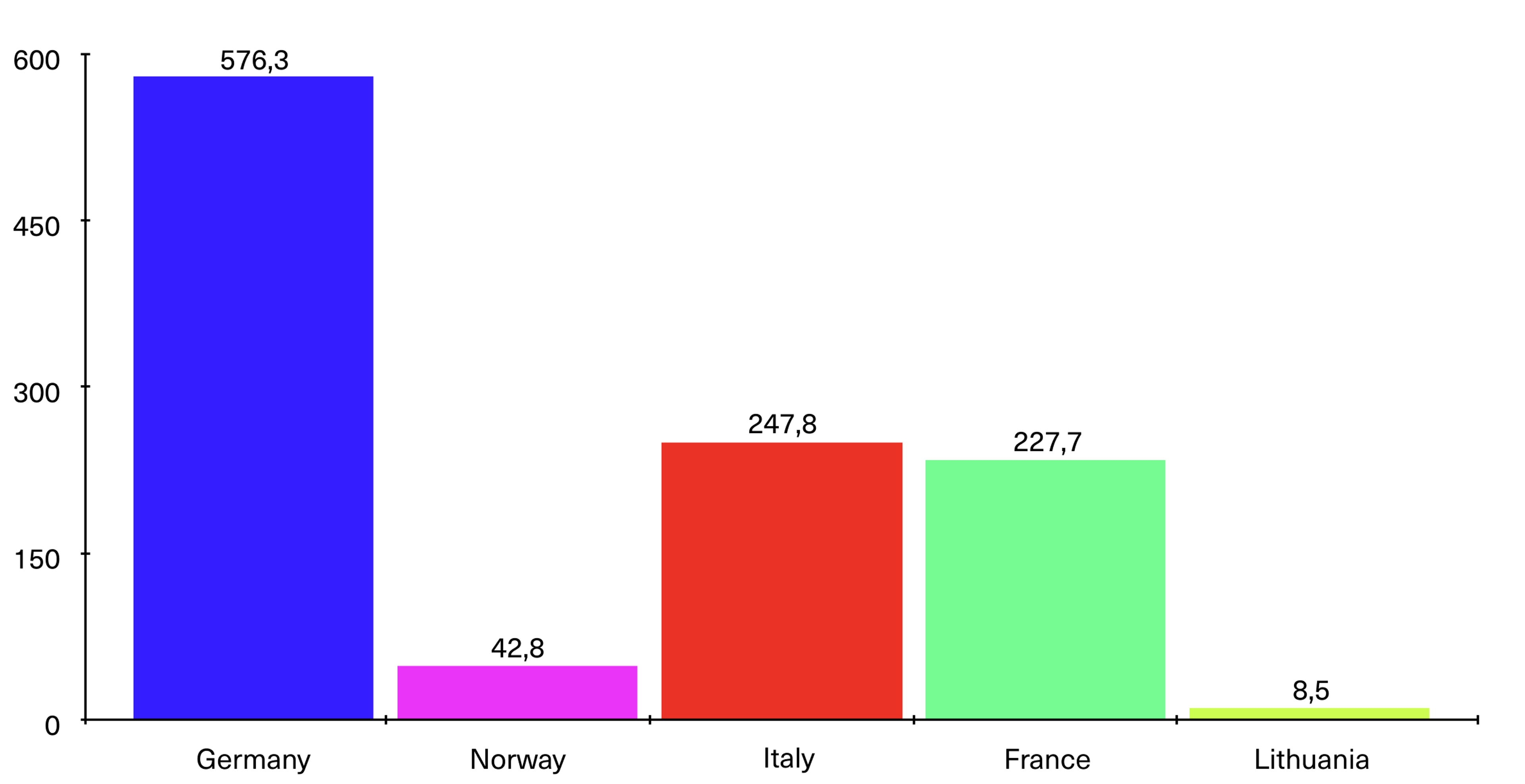
But let’s get back to the carbon emissions example. In this case, we don’t have figures that show the progression in each country over time, only a comparison between different countries at a specific point in time. In this case, we would use a bar chart. This allows us to distribute the carbon emissions from the five countries in bars to see which ones contribute to the largest emissions, as shown in the figure below. A line chart, on the other hand, could be used to display the progression of emissions in one or several countries over time.
Scatter plot
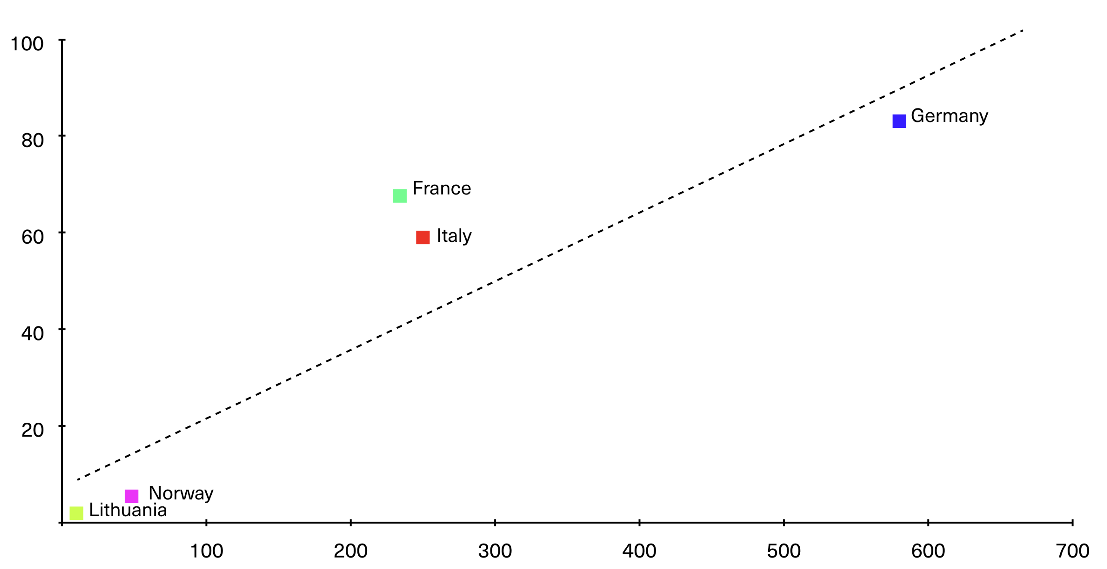
The bar chart is effective for demonstrating total emissions. But it doesn’t tell the complete story. Therefore, let’s look closer at a chart that can communicate multiple variables simultaneously. Say we are going to compare carbon emissions with population size in several countries. A smart way to visualise these to variables, is with a scatter plot.
Visually, a scatter plot (also called a scatter chart or point diagram) can resemble a line chart.
Both methods display data as points in a coordinate system, with one variable on a y-axis, and the other on the x-axis. A trend line, i.e. a straight line drawn through the data points to illustrate a general tendency or pattern in the data, runs through the chart. This is an example of linear regression that you learnt about earlier.
Where a line chart is most commonly used to show how data has developed over time, a scatter plot is best suited to demonstrate how variables influence each other or how they can be viewed in relation to each other. As you see, this tells a slightly different story than the bar chart above.
Bubble chart
So far, the examples we’ve shown have been ways to visualise data in two dimensions. Population and carbon emissions are two different variables, but what if you need to visualise even more variables?
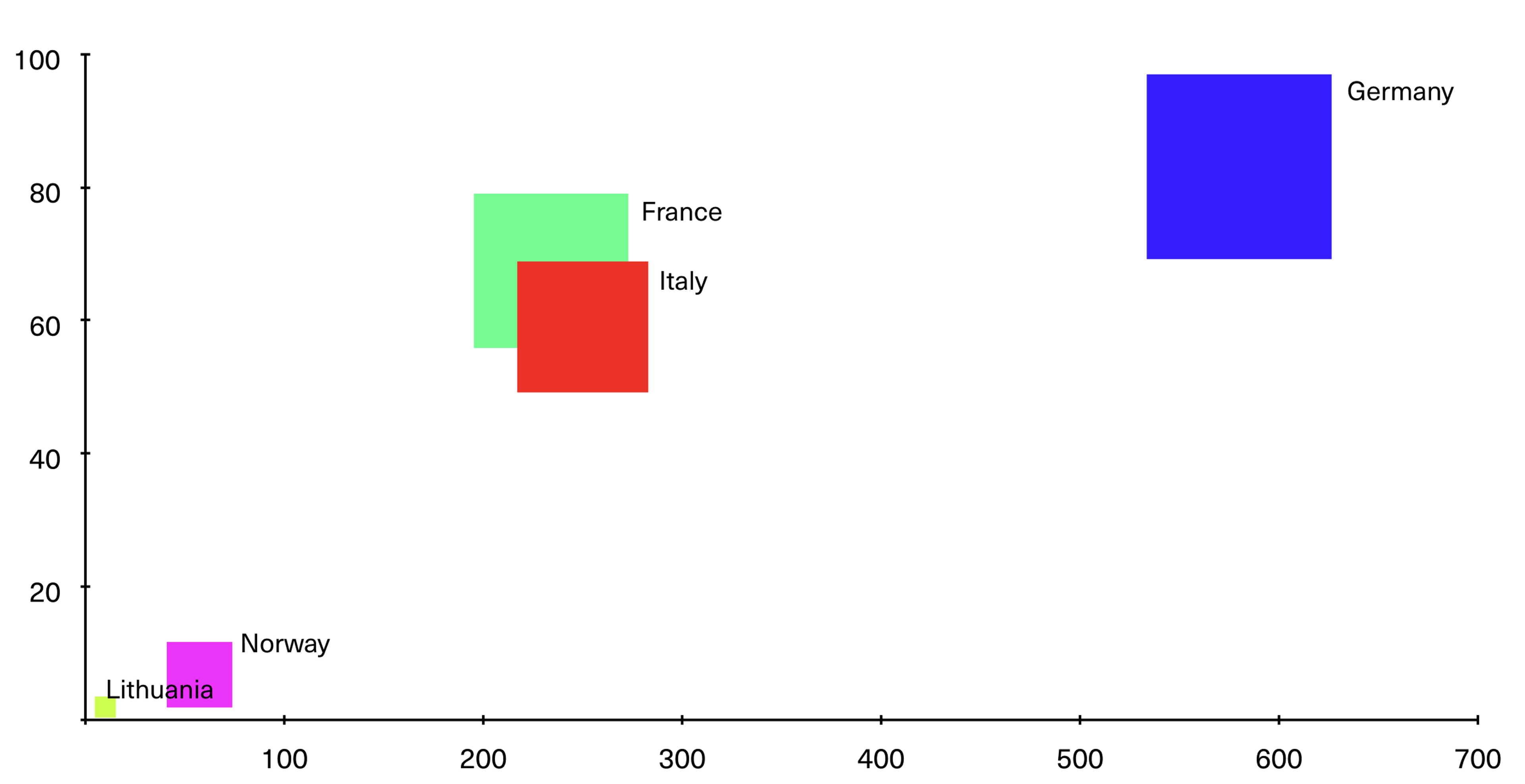
A bubble chart (or a bubble plot) has much in common with a scatter plot, but instead of displaying two variables, a bubble chart is three-dimensional. The x-axis shows one variable, the y-axis shows another—while the size of the data points (or the bubbles, if you will) represents a third variable.
This time, we’re going to visualise data showing population, carbon emissions and GDP for several European countries. We can use a bubble chart to show how these different variables are related.
This time we’re placing GDP on the x-axis, while the y-axis shows population. The size of the bubbles—or, in this case, squares—will represent the magnitude of the country’s carbon emissions.
Heatmap
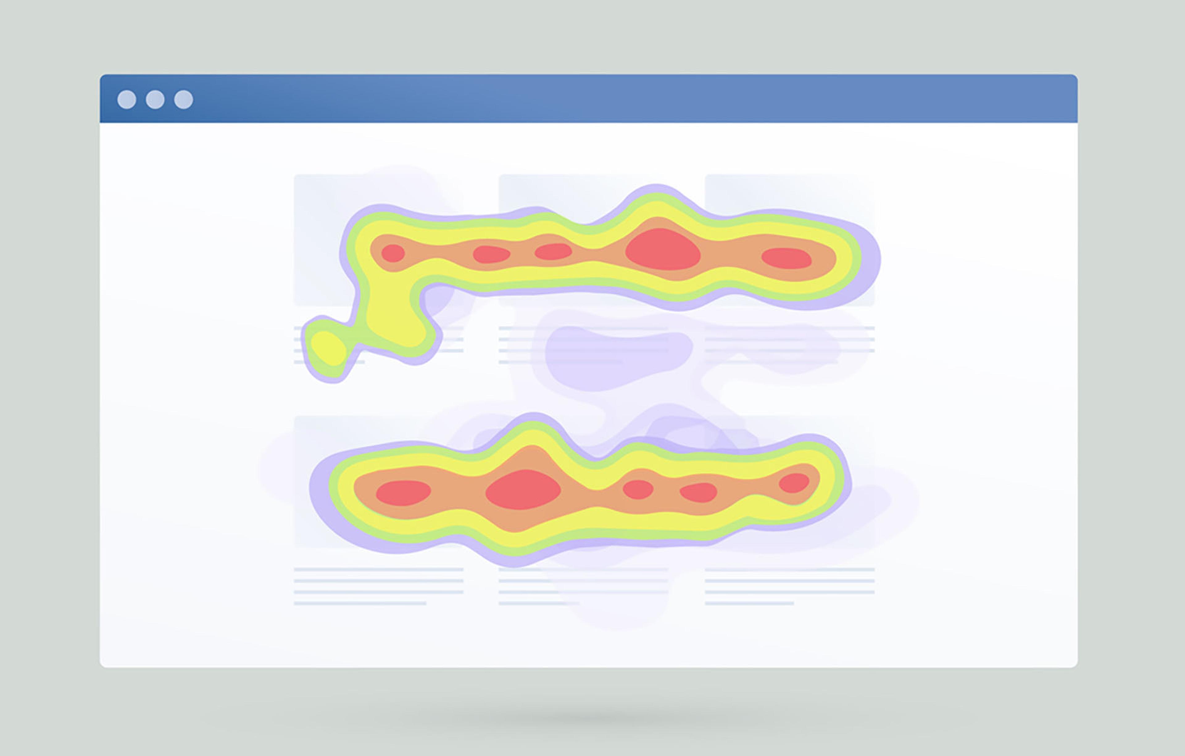
A heatmap (or heat map) uses colours to illustrate the relationship between different values or categories. Warm colours represent high values, while lower values are represented in cooler colours.
Often, a heatmap is used to visualise data graphically: If we were to present carbon emissions data from European countries, Germany would probably be very, very red, while Latvia might have a greyer, cooler tone.
Heatmaps are also used, for example, to show activity on a website, where one can track where users point their mouse, how far down the page they scroll, and what they click on, among other things. This allows us to see how the website is being used.
Other common methods for data visualisation
We have looked at some common diagrams. Here are some other methods that can be used to visualise data:
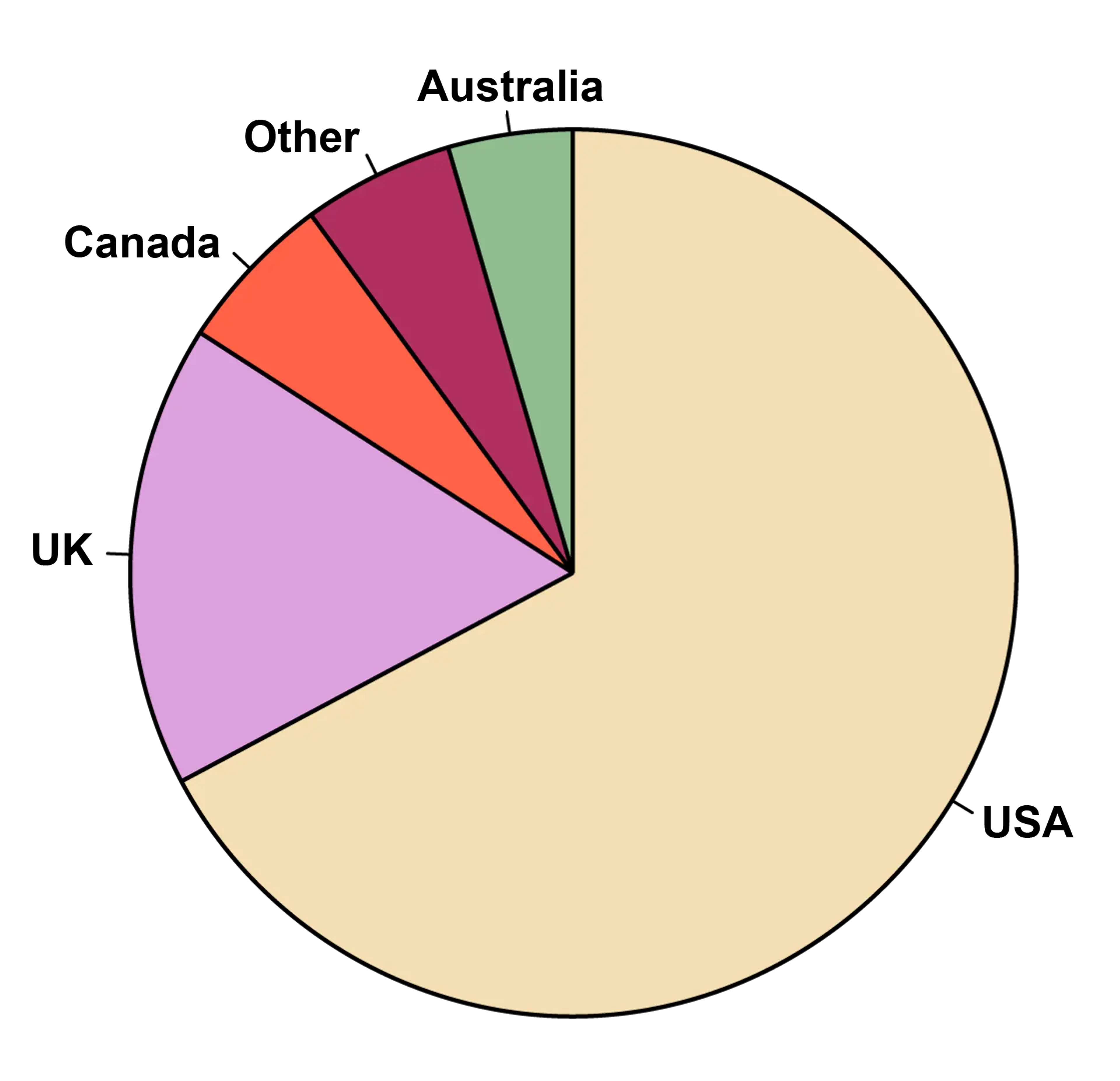
- Pie chart: A pie chart is a good way to show how different components relate to the whole. This is often used in journalism, for instance. It can be efficient in certain contexts, but is not well-suited to present large and complex data.
- Timelines: Timelines can be a simple way to visually indicate progression and development, and can often be a starting point for infographics.
- Networks: Sometimes it may be necessary to show how certain data points or categories are connected. Here, we can utilise networks, where the data points are visualised as nodes—connected with links. (We saw an example of this in the topic on data mining). By adjusting the size and colour of the nodes, you can also highlight categories of great importance.
- Venn diagram: A Venn diagram is used to present relationships between different groups or categories. Each category is represented as a circle, and the area where the circles overlap shows the correlation between the different categories.
- Word cloud: If you have conducted a survey where several sentences, words or phrases are repeated, a word cloud (or tag cloud)—which we have seen an example of earlier—can be a simple way to show patterns in the survey. It can also be used as a visual element.
45 ways to communicate two quantities
Two numbers, visualised in 45 ways.
Infographics
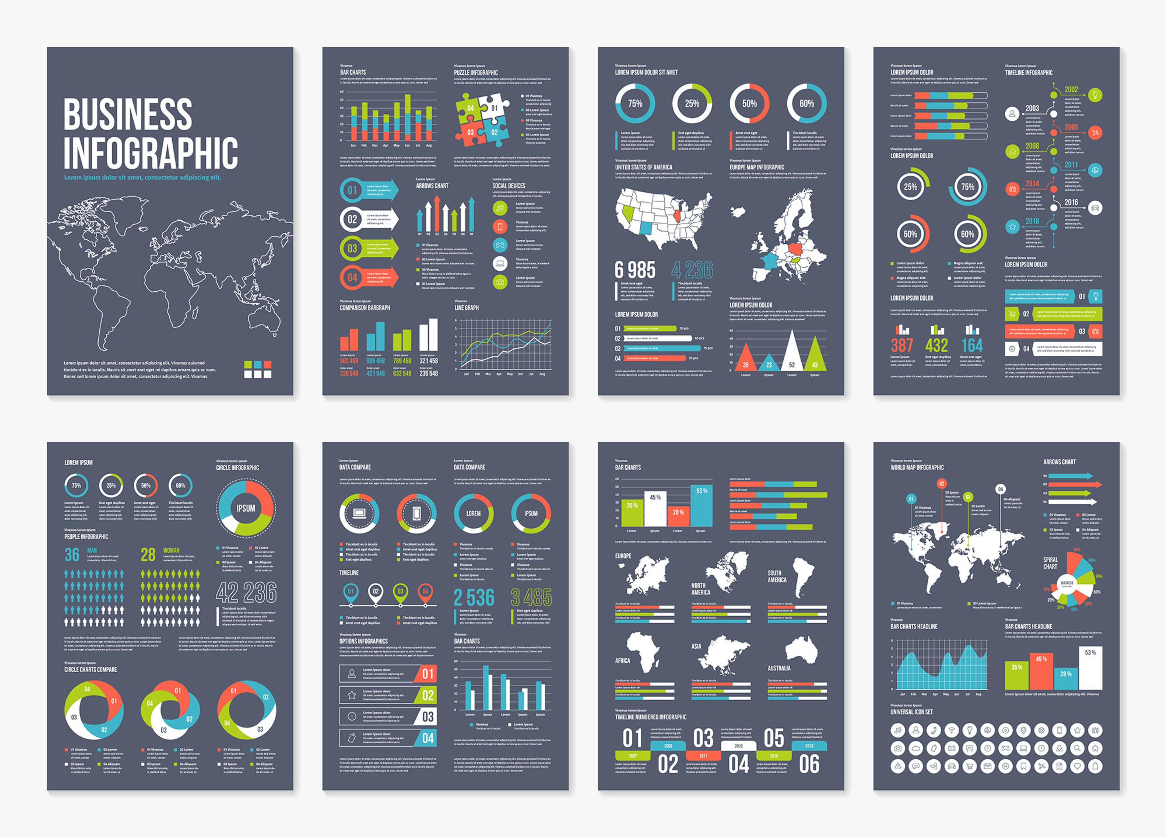
We have discussed how data visualisation is essentially a form of storytelling. Therefore, it may not be sufficient to use a chart or a timeline alone to convey the entire story. Sometimes, you may need to combine several of these tools to make the message interesting, informative, and engaging.
This is what we call infographics.
An infographic is a collection of icons, graphics, data visualisations and a small amount of text, that together provide an easily understandable overview of a topic. This can make it easier for the recipient to understand the information and connections.
An infographic can …
- be used to present complex data in a concise, visual way
- be a data-rich visualisation of a story
- present data in a more convincing, insightful and engaging way
- be a tool for educating and informing
- invite further in-depth exploration and interpretation
Insight
Communication and interactive exploration
When talking about visualisation, we can think of two different categories: visualisations for communication and for interactive exploration.
Visual representations for communication aim to explain a phenomenon, finding or analysis in an easily understandable way. The point is that the message should come across as clearly and simply as possible.
Visualisations for interactive exploration are typically a bit more complex. Here, the recipient can be invited to explore the data on their own. For example, imagine a tool where you are presented with a simple world map with silhouettes of different countries, that allow you to explore and compare their carbon emissions.
Here you can choose between viewing options that change how the map appears—such as viewing emissions as a heat map. Or you can choose different forms of colour coding, where countries are given a specific colour if they have signed the Paris Agreement, and the saturation shows how far along they’ve come to achieving their goals. By clicking on the countries, you can bring up key information, tables and graphs, compare countries across the board and select variables and filters to explore the data and highlight insights in different ways.
Tools for visualisation
There are many different tools for building your own visualisations. Let’s take a look at some of the most common:
How interactive visualisations are used in the media
Can you always visualise data on your own?
Designing visual outputs of data so that non-technical data users can analyse data and find answers to their own questions is called “self-service analysis”.
Most of the examples we have come across so far in this subsection are examples of how you can easily present simple visualisations, which can be easily read and interpreted by most people.
This can be done with simple and accessible tools like Excel or a design program. At the same time, there are limits to what can be achieved with this type of visualisation, and they are rarely used as a basis for decision making for larger decisions.
More complex visualisations, intended for larger groups—such as a workplace—or for important decisions, are usually designed by a front-end developer or interaction designer who has expertise in designing and building tools, dashboards and visualisations with tailor-made user experiences.
When you need to display data in real-time, technical solutions are also necessary for this to work. This can and should be automated by using suitable software for visualising different types of data, to ensure that the correct technical decisions are made.
This is typically what characterises a dashboard, which we will now take a closer look at.